Monday 28 February 2011

Thought I'd try the design on a white background seen as I hadn't yet. I think it works and looks ok, though not as well as on the black background.

The white background allows the illustration to be the correct colour as seen in the film (black).


I felt brave enough to try out an orange background. I thought it was about time.

Back to type

The simplicity is nice here. The parts of the clock is inspiring.


I like how type has been as image here. The colours play a big part too. I find this interesting.


I think I'm getting somewhere! I feel as though the title of the film works well at the bottom of the poster, below the image. The colour really compliments the poster as a whole down there. I think it was a bit too distracting when it was placed in the middle.

Perhaps the image could do with being scaled down a little. I want it to bleed off the poster though, so maybe it could just be moved down a little. Either way, it's a bit too close to the cast at the top.

I've been playing with the layout more. I think it's important to document every change I make. It makes it a lot easier to see what I've explored layout-wise.
Since looking at existing posters, I've altered the tone of the background. I feel it needs to be dark, though black is a little too dark. I've taken it from 100% to 95%, and I think it's made all the difference. I will definitely use orange within the design. It is complimented a lot more with the change of the background.

I've also started introducing new typefaces, to see what does/doesn't work.

Sunday 27 February 2011

Existing typographic posters

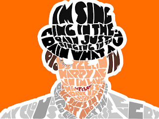
I find this visually appealing. It hasn't got your average line after line approach. I like how letters have been split which compliments the other type, and represents what is being said/communicated.

The composition is lovely. It's refreshing to see an appropriately arranged type design.

I also like the colours used here. The background seems to be just off-black which is a nice idea. It's not too dark, yet still gives off deep, serious emotions. The white type on the background doesn't come across to powerful either.
The brighter colours are a nice touch.


This is similar to the poster above, though half of the number has been completed using illustrations. This is a great idea. It's really interesting and it's something I'm definitely going to think about having a go at.


I really like these (below). Rather than just plonking an image in the middle of the frame, composition has been carefully thought about. The designer has thought outside of the box.
They both look very appealing and attracts the eye. The colours are also really nice and work well together.


Type?

I thought a typographically lead poster would be interesting, though I haven't thought about typefaces as of yet. I've just been playing around with layouts...initial layouts that is, to give me an idea of how things could potentially look.

More variations