I've taken a fair few photos of the Stanley Kubrick work. I wish I had access to proper photography equipment, alas, I did not and had to make do with natural light and the studio tent.
Monday, 30 May 2011
Sunday, 29 May 2011
New nom photography

 I needed to get some more photographs of the range of nom biscuits as the previous batch had been wiped when my mac died.
So, here we are, just a few that I've chosen to edit.


Ticket holders
 A bit late, but I decided to make up some quick ticket holders. I thought it would look a bit more like a big event like that, rather than just a loose ticket floating around.
This is just a rough I made, but they're generally going to look like this. I'll be using black stock, to go with the theme of the rest of the promotional work.
Saturday, 28 May 2011
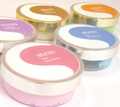
Final stem
 Here are the final products for the new range of beauty products, stem.
 I'm pretty happy with the outcome of the packaging. I started with the cream labels, which expanded to the other products. It's very versatile and can easily adapt to the different formats.
I came across a slight problem when it came to putting the soap packaging together.


Friday, 27 May 2011
Me new labels


I revisited project 'me'. I didn't feel as though the labels on the water bottles done and justice for their purpose.
I bit the bullet and bought the bottles I originally envisaged using. I didn't realise when I bought them, that the glass was dark, so I was a little disappointed. I decided to go ahead and use them still, and to be honest, I actually think the darkness works in my favour. They look a lot more medicinal, and though they're there for a purpose, which they are. They definitely work a lot better than the boring water bottles.
I felt as though the original labels were not only boring, but very unoriginal. I didn't put much thought into them. I know I wanted to keep the label quite minimal and to the point, so I think my problem was that I had too much of a label and it just kind of dragged and looked boring.
The new labels are minimal and too the point. It clearly explains what the remedy is for. The tags around the necks of the bottles communicate the ingredients that can be found in each bottle, in more detail. I thought it's something nice to have. The customer will feel like they're getting something a little extra, as well as the remedy, so this small addition could potentially create a few more sales!
Something else that might be worth mentioning, is the colour of the labels on the front of the bottles. I was leaning more towards the full coloured ones, as displayed in a previous post. After testing them out with the neck tags, it all looked too busy and colourful. I felt inverting the colours would be best, and definitely works a lot better.
Long labels
 I'm pretty happy with how the new labels have turned out. As you can see from the picture, they were all originally made to be tall, but I've decided to chop them up a little to the size of the green one in the middle at the bottom. After trying them out on the bottles, they looked a little strange, and not how I thought they'd be! I'm happy to make them all smaller. It kind of makes them a little more special in a way, I feel.
 I tried adapting the original labels in an attempt to improve. I thought maybe inverting the background colour to the colour of the each labelled logo would be a nice touch, but I still think it fails as a label. For something that I want so minimal, it just doesn't work in this format.
Here are the newest additions to the 'me' label development. These will make up tags that will hang around the neck of the bottles. On screen they look quite interesting, so I'm hoping they work once printed! Fingers crossed!


Lavly
I thought these are a nice little set. I'm assuming they're part of a whole anyway.
I really like the tubs . They're tall enough to enable some kind of label to sit nicely, as well as having the potential to lay on top of the lid.
I'm having trouble understanding how these relate to each other, other than using the same tub. The designs are very unique and seem quite separate.


Soap?
 I'm going to expand the stem collection, and cover other products can be found within the brand name.
I thought to start it off, I'd look into create soap boxes.
I've been trying to come up with an appropriate size for the boxes to be. I don't think they should be too big, but then again, not too small.
A quick mock up here, I used the same measurements for each side of the box. I didn't realise at the time that two facing sides had to be smaller!
Smelly sets
 I love this packaging. I'm loving patterns right now, and I'm enjoying creating them, so this really appeals to me. It's nice to be able to see this in its range. It's inspiring me.
 I found this image online, and it's just screaming ideas to me as to how I can extend the range of products and sizes within the products. Hotels for example, provide small free soaps and gels. Perhaps I could look into this a little more and see if 'stem' fits into this idea?
I thought of this after thinking about the samples hotels supply. It might be a nice idea to supply a tester for a certain product within the 'stem' range. Something that could potentially be sent out in the post when someone signs up to promotional offers, or something that could be handed out within certain shops. It's a strong idea that could work.
Thursday, 26 May 2011
Altered
I've been working on getting some nice little illustrations ready to apply to the stickers. Like I mentioned before, they look ok, but really quite bare. It's something I really enjoyed doing with my biscuit brief, so I thought I'd have another go at it.

A few are a little difficult to see because I've dropped the opacity down a little as I wanted them to be quite subtle. Still though, I think they look a lot better than before, and I'm looking forward to seeing what they look like once printed!
The patterns were originally going to be placed on the coloured part of the sticker, but I had difficulty budging the white border around the drawings. I think in the long run, having the pattern on the white part works better. They may have been a bit of a distraction from the type. Nevertheless, I'm happy with where the pattern is now anyway.
Tuesday, 24 May 2011
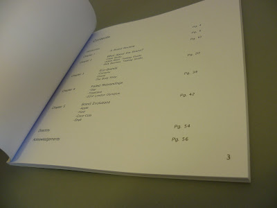
Design Context Publication
 I'm pretty over the moon with my design context book! It's a major relief too, I'll admit.
There's a few bits I've noticed that aren't quite right, but nothing can be done about that now, so I'll take the time to document them instead.
I took so much time looking over it, making sure everything was right, alas, everything was not!
I'm happy the pages printed correctly. That was probably something I was most worried about going wrong, and something I looked over a thousand times.
I somehow managed to fail spotting a ''typo''. Not a misspelling, but a missed space between one of the headings. Gutted.
There seems to be a few sporadic marks, that must have come from the printer. But annoyed about that, but what can you do!
Overall, I'm absolutely chuffed to bits.
I'll be taking better photographs of it soon. I just wanted to get it up here and express my super amount of joy I'm currently experiencing! :D


Monday, 23 May 2011
Final crit feedback
Today felt like any other crit, just spread out over a long period of time! Nevertheless, it was helpful, just like they usually are, and it was interesting to hear people's feedback. It was a little confidence boost too, so that was nice.


I got some really helpful feedback, explaining how I can push my work to cover specific areas.
Here are the feedback forms people in my group filled out for me. Cheers guys!
Heme
Eye catching designs! Really nice! The designs make up a lovely set and are easily adaptable to various formats.
The shape of the bottle at the front is a nice idea, though I don't think it's appropriate to what I'm doing.


Sunday, 22 May 2011
Candles?
 I'm aware this isn't a bathing product, but I had to include it anyway..
I've come across this candle and I'm loving the background patterns! Like I keep saying in my posts, they're so simple and easily adaptable to suit flavours etc.
I like how the logo has been placed on a background colour so it can easily be seen on the patterns. It's a great idea, and something I'll probably use at some point. Very nice indeed.
Flower sketches
After printing out my initial stickers, it came to my attention that it was gasping for something else as it looked very bare and minimal.

I've drawn the flowers each cream will smell of, and will use them somehow within my artwork.
I've never been happy with anything I draw, but I've found out I love this kind of rough illustration.
I'm very excited to get in scanned in and get working with it.
Friday, 20 May 2011
Stem Creams
 Just a few quick mock-ups of some labels I'm working on for scented body cream. Still very work in progress.
I do like these, but they feel very bare. I need to work on the type, and I think I'm going to have a go at some illustrations to use.
I will take into account the base of the tub, and design that too.
I think I'd quite like to extend this, to cover a range of products. I think it would all work really well together.

Buttermilk Barn
This looks like it's a sticker, it's really nice! Very cute-looking and innocent. Depending on what the range looks like, it looks as though it'd be targeted towards a youngish audience.

It gives off a very barn-ish kind of feel which makes it a lot more interesting than it should be, so it's nice to have that little extra. I'm not entirely sure whether the country background look is a photo, or whether it's the kind of stock, either way, it looks very whole.

Thursday, 19 May 2011
Brands: I'll Be There For You
Well, I've somehow managed to finish my design context book! :D I'm now in the final process of waiting for it to be delivered, which should be in 3-4 days. So I'll get some photographs up of it once I've received it! For now, here's a PDF for your pleasure.
Wednesday, 18 May 2011
Stem
I'm working on designing labels for tubs of body cream. I've come up with the name 'stem', because the creams will come in a variety of flowery scents. I thought the name was not only appropriate, but catchy and just worked nicely.
I've been trying to design the logo. From what I've seen, looking at existing body creams, the logos have been extremely simple and bold.
(logo sketches)
Tuesday, 17 May 2011
Existing
 Since looking at existing body creams, I can see the layout is very clean and simple...hurrah!
There's minimal type, and simple imagery, followed by a bold, clear logo.
It's nice to see the range of products that are available within the one scent. I will take this on board when designing, to ensure the artwork works alongside a variety of products.


Friday, 13 May 2011
Roast leaflet
I've been working on putting a small leaflet together for roast, to show what they have to offer.


I also thought it would be a good idea to introduce the typeface I designed, after making the logo. Since having a play with it, I came to the conclusion that it's too illegible, so wouldn't work. Perhaps it could be used some other way. Either way, it's still a typeface that will have the potential for something!
The leaflet will be a concertina, consisting of 5 folds. This would give me more than enough space to work with.

Subscribe to:
Posts (Atom)