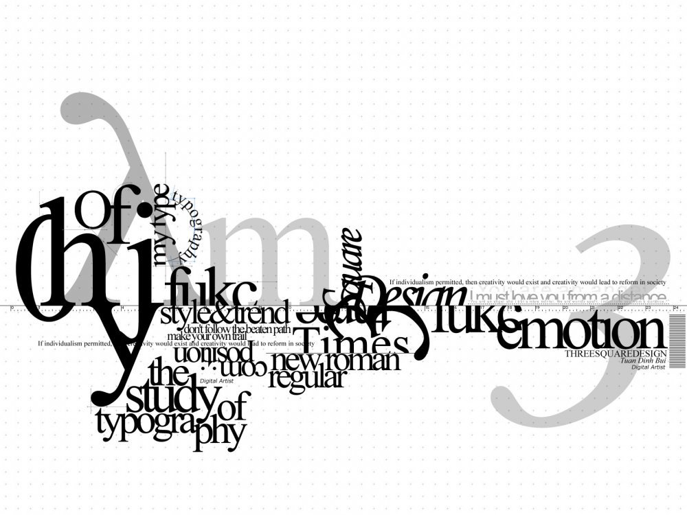
 I'm exploring type and type within illustration.
I like how type has been placed over lighter type here. It's very interesting and surprisingly neat. This could be a nice idea for me as I will be focusing on how type can be tightly fitted together. It can't really be any more compact than when it's on top of each other!
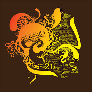
I like the colours used here. They work well together and work well alongside the topic of the writing.
The illustrations are lovely too. They really compliment the type and gives it structure. The whole thing is very pretty, but I don't think this is the path I want to take. It's still something to consider though.

This is interesting because my idea is similar to this as I will be repeating the same words.
I like how these words create something that almost looks like a shape. It's interesting to see that it isn't just a block of typography. This looks a lot more interesting.

As for this... I just like it because I do. :)
No comments:
Post a Comment