Showing posts with label OUGD303DC Brief 1 Nom Biscuits. Show all posts

Sunday, 16 January 2011

Mallard

I've come across some really inspiring packaging for tea.

It's absolutely gorgeous. I like the idea of a patterned background with a simple image in front. Being able to see through something to see the background is a really nice idea.
I also like how a variety of patterns have been used. It makes each cup a little more special and exciting.

Dorset Cereal

I spotted a really nice piece of packaging lounging around in my flat.

Dorset cereal packaging has hugely inspired my train of thoughts for this project.
I particularly love how shapes have been cut out to enable the customer to see inside. It's nice how this has been taken from their logo. It's a great idea.

Saturday, 15 January 2011

Biscuiteers

I was sent a box of specially made biscuits, created by the Biscuiteers. I thought I'd document it on here because it's a nice idea as to what could be designed/created for my project.

It's a lovely little package.
I love the stock used for the box. It has texture which is a nice touch.
The identity of the company is also very attractive. It has been foil blocked which is aesthetically pleasing.

Rich tea

Since I nom'ed all the rich teas, I found it interesting looking at the packaging. I thought it may have been a good idea to see what information is used, and to see what the most important bits are.

I made a few notes to point out the important parts.

Friday, 14 January 2011

Fruits

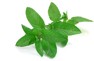
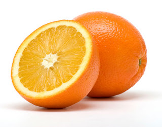
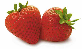
Just a few pictures to help me get abetter idea as to what things look like. (I'm not very good at drawing from thought!)


Fruity

I've chosen 'nom' as the name of the biscuits for now. I want to see what I can achieve with this name. I think it's original and interesting but still memorable. It's short and sweet! I think it suits the target audience.

I've been looking at existing logos that I'm hoping will inspire me.

I particularly like the 'blush' type. It's so clean and easy, yet it has so much character which I find really interesting. The little illustration above the type is nice, though I see it as an extra. I don't want to overdo my logo, so I'm unsure as to whether I will need it.


Again, I really like this logo.
The type is lovely. Again, really simple and characteristic.
As I mentioned before, some logos don't need illustrations. I'm not overly keen on this illustration, though I think it's kind of relevant. If it were mine, I'd probably reduce the size of the illustration to fit the type. I think it's way too much it being the size it is.


The rest of the logos I've looked at I'd say are more my style. The type and image feels even.

Inspired

Elmwood designed labels for a range of wines.


I love the illustrations. I really think it's a nice idea showing the flavours that will be experienced through drawing.
I wouldn't call myself an illustrator, and normally I wouldn't like anything I drew, but I think I'm going to take inspiration from this and have a go!

Thursday, 13 January 2011

Luxury biscuit packaging

I've been browsing luxury biscuit packaging.

I really like how colours have been used to distinguish each range.
I'm not overly keen on the idea of using photography on the packing, but I do
like how it's bent to be visible from above and on the front of the packaging.
As it stands, this is similar to what I've got in mind. It's interesting to see where the type and image is placed. It's inspiring me to think of different ways in which I can display the packaging information.


Although I can't say I like the shape of the packaging too much, I do like the way in which a window has been applied to be able to see the product inside of the box. It's nice to be able to see exactly what you're buying. I've had this idea lingering also, and I like how it's folded to appear on almost two sides of the box. It makes it more interesting.


These lovely pieces of packaging gave me the idea of the range of packaging I could design to fit different places that would sell these biscuits. The biscuits are not luxury biscuits, though they're nice biscuits and will be sold at a reasonably expensive prices in coffee shops.

Usually, biscuit packaging in coffee shops consist of 2 or 3 biscuits. I want to be able to cater for this because this is just the case; people usually just want a couple to have with their hot drink. Packaging for a higher number of biscuits is still an option. They could still be sold in coffee shops for those who enjoy the 'taster' couple they consume. If the customer wants more, they can purchase a bigger pack.
Alternatively, they could also be sold in supermarkets, though this may change my target audience.

I wanted to see what other materials could be used as packaging.

These are beautiful. They're so simple but still look really inviting and clean. I think they look a lot more upmarket and special than a box. The customer can clearly see inside the packaging which makes it a lot more tempting to purchase.
I particularly like the Franks packaging (at the bottom). The tags are a lot nicer and are a lot more eye catching than what appears to be stickers on the other see-through packaging. The tag also covers most of the bag, which is probably because of the scale of the biscuits, but I think it looks a lot nicer and comes across more of a 'luxury bite'.

Existing packaging

I've been looking at existing packaging and I came across some seed packaging.

I really like the simplicity of it. It's so bright and eye catching.