Showing posts with label OUGD303DC Brief 3 Roast. Show all posts

Thursday, 31 March 2011

Eco friendly menus

Giraffe and Serena
I love the feel of these menus. They're so bright and cheerful.
The format is also very nice, and works well with the name, giraffe. This has made me think that perhaps I could do something along the same lines, and play on roast.


I don't want to lose face about the whole eco friendly approach, so I'm looking at menus that have taken this into account.

Letterpress
This is simply a lovely menu. It's been made for a wedding (so a little different to a coffee shop!) so I'm not sure whether this technique would be ideal, but it's certainly worth keeping in mind.


These seem nice.
They're bound together with what looks like ribbon which is a nice idea.
The format is also small and slick. I've been thinking about how big it would be, and I initially thought it would work best on a smaller scale.

Tuesday, 29 March 2011

Inspiring

Strange I know, but I ordered some example wedding invites, just to have a lot at some of the folds used. I thought it might be a good idea for when it came round to designing the menu for roast.
I received some really interesting examples. A really good mixture too. I done fairly well when ordering these, hah.

I particularly like the more simpler folds; long ways, three folds and one fold, though like I mentioned in a previous post, I don't think it will be enough space to fit much information. I still haven't gathered the content (I guess I should do that pretty soon- so I know how big/small this needs to be). It might make it a bit easier!


Coffee patterns

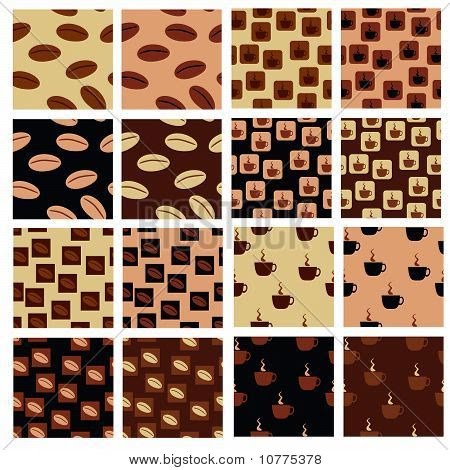
I've come across some pretty interesting shapes whilst looking at various coffee beverages. I like the thought of coffee being represented by a certain look.

I also find what looks like some sort of wrapping paper (possibly used for packaging?) with the coffee artwork covering it. Hmm.. my creative senses are tingling..


I found this very unique; postcard menus. It's a nice idea, but the amount of information that could be displayed would be restricted, so I don't think this would work for me. Nice idea though.


I really like the illustrations used here. They're very simple and clear. This is a possible pathway for me when designing the menu for roast.


The type here is horrible. I certainly wont be using a funky typeface on the roast menu. I find this menu very child-like.


I've included this mainly to just provide me with some ideas as to what beverages to use...

Whilst it's up here though, I may as well comment on it.
I'm no longer a fan of whacking a logo in the centre of the background, with an opacity of 25-50%. It looks very tacky, and with this especially.. just generally doesn't look right. I will use the logo more effectively when designing the menu for roast.


I've seen a fair few menus that include photography to illustrate the various coffees available. Though I think this is a nice idea, I think it's over-used, so I'm going to try to come up with something different but still successfully represents the products.

Monday, 28 March 2011

Flowers

Just been having a nosey to see if I could find any tutorials or examples of flowers made out of tissue/napkins. I'm thinking of making a bouquet out of roast coffee shop tissues.


Advertisements

I thought this was a really interesting idea, and it kind of relates to what I'm aiming to achieve with the advertisements for Roast.
It's incredibly simple. The message is clear and easy. A very fun piece of advertising.


The idea of using a number of objects to create something else is also an idea that could be pushed.
This is fascinating in terms of where the eye is attracted to, and how it moves over the advertisement.


Friday, 18 March 2011

Waterstones


Thought I'd sit in Waterstones for a while to have a browse at their books, see what they have to offer in the world of signage.

I found (got one of the employees to find) some really interesting books.

Titles:
'Signage Systems + Information Graphics', by Andreas Vebele

'Mapping Graphic Navigational Systems', by Roger Fawkett and Tang William Owen

'Left, Right, Up, Down - New Directions in Signage and Wayfinding', by Gestalben

I came across some interesting information in the very last book, about logos. I thought it might have some use regarding my contextual book.


I really like the idea of having graphics on the floor, as well as on the walls. I think I could come up with something really nice, using the artwork I've already designed.

On the thief..

I stole anything I could get my hands on during my coffee shop visits; just little bits and pieces that I could produce for Roast.


I love the booklet Nero provide, full of the different coffees they sell. I originally wanted to do something along these lines, so I'm really happy I came across it!

Coffee shops in town


I went undercover in town today and took as many pictures as I could of coffee shop signage. The roast brief is one of the bigger briefs I'm working on, therefore I aim to cover as much ground as I possibly can.

I didn't go out with my camera purposely to get amazing photographs because they're purely for inspirational purposes, so some of them are blurred.

I also took a few notes and made a few sketches for myself whilst on my little investigation...


I got a lot out of what I done today. It made me think of other possibilities to attend to.

Wednesday, 16 March 2011

Sandwich packaging

Just looking at some typical pieces of sandwich packaging to give me an idea as to the shape, and also gives me an idea as to how to go about designing my own in this kind of form.
Like I mentioned in a previous post displaying my cup designs, I want to keep the food packaging simple and clean.


Interesting sandwich packaging

These are really cute and very unique. Though the packaging is the same, the artwork is very personal towards each flavour. The colour choices are nice.
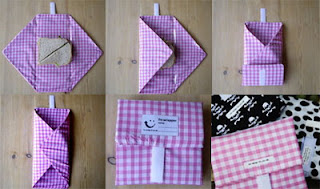


Though only a screenshot, these are quite inspiring. I like the colourful designs. They're visually appealing. I also like how the artwork spreads around the packaging, so it's not just cut off.


Thursday, 17 February 2011

Typography

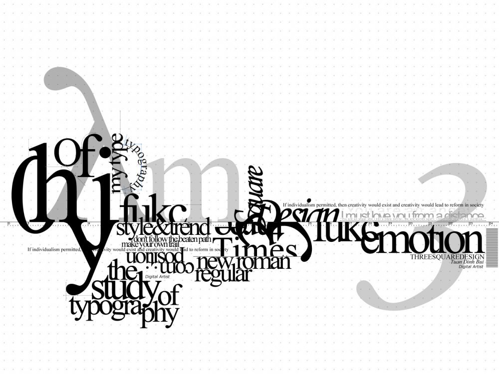
I'm exploring type and type within illustration.

I like how type has been placed over lighter type here. It's very interesting and surprisingly neat. This could be a nice idea for me as I will be focusing on how type can be tightly fitted together. It can't really be any more compact than when it's on top of each other!


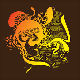
I like the colours used here. They work well together and work well alongside the topic of the writing.
The illustrations are lovely too. They really compliment the type and gives it structure. The whole thing is very pretty, but I don't think this is the path I want to take. It's still something to consider though.


This is interesting because my idea is similar to this as I will be repeating the same words.
I like how these words create something that almost looks like a shape. It's interesting to see that it isn't just a block of typography. This looks a lot more interesting.


As for this... I just like it because I do. :)

Thursday, 10 February 2011

Packaging inspirations

I've been flicking through some packaging books to see if I could find some interesting packaging ideas.

I like the idea of applying a design to simple packaging, such as these bags. Though it's such a simple idea, they look very professional and clean.


These boxes are so cute. They remind me American takeaways. They're very compact. The handle is a nice feature, and I may use this idea in my designs. It makes it that little more personal.


I thought about using similar packaging to packed coffee is a nice idea, though I'm not too sure whether it's entirely relevant. It's certainly something to think about.
I like the window at the front of the packaging, so the customer can see the product inside.


I won't be able to use this particular idea as the
packaging will need to cover all the food, I really like this idea. I'm definitely going to look into bands that could run around the packaging. It looks lovely!


The separate compartments are a nice touch. It could be a potential design idea regarding cake packaging.


This is a lovely box which would be incredibly suitable to hold something such as a cake. It looks a bit fancy though. I want everything to look quite uniform, so I'm not sure if it'd actually work. It's work giving it a go though. I'm intrigued by this piece of packing.


Wednesday, 9 February 2011

Packaging ideas

I've had the idea of using a similar design as an egg box to create packaging for the coffee shop's products. I like how the the packaging has to be opened in order to get to whatever's inside.
The material used in the second picture is lovely. It looks very textured which is what I want

Eco friendly packaging

I've been looking at eco friendly packaging, to give me some ideas as to what I could create for the coffee shop packaging.

I like how minimal the material is. The see through plastic is nice, especially because it's covering the majority of each product.


Again, I really like the holes at the front of the packaging.
The whole packaging looks very rough, but it suits the product and screams eco friendly.


The compartments are a nice touch, though I don't know how it could be incorporated with coffee shop products.