
Showing posts with label OUGD303DC Brief 4 Stanley Kubrick. Show all posts
Showing posts with label OUGD303DC Brief 4 Stanley Kubrick. Show all posts
Wednesday, 23 March 2011

Tuesday, 22 March 2011
Postcards
I'm going to apply the artwork designed for the set of Stanley Kubrick posters to various forms of promotional material; postcards is one of them. A lot of cinemas provide a stand full of postcards, so I thought it was appropriate to create them.


I like the use of black and white here. I think it works really well because of the artwork.
These are focused purely on the imagery, with the exclusion of type. This is a possible pathway for me.
These are also really nice. The title of the film has been used on all of them, and is displayed in the bottom left hand corner. The use of a border is a good way to separate the image from the type. I'm not sure this would work for what my postcards, but it's worth keeping in mind. It certainly works for these though.
These are similar to the 007 postcards, though the title can be found at the top instead of the bottom left corner.
These are very simple, but also really nice. Apart from the first one, they all clearly display imagery. They look hand-drawn, so I think the illustrations are all that's needed. Any more information, then it would probably begin to look very busy. This is something to keep in mind- the busyness of the postcard.
Friday, 18 March 2011
Stanley Kubrick: 2001: A Space Odyssey existing posters
 Though the imagery may be appropriate, I can't say I like this too much. I think it looks weird (though perhaps it was meant to look weird to which then reflects the film!!)
I find the use of colour interesting here. It's very bold and brave to use what seems like just one colour. It's a nice idea though.

I love the simplicity of this poster. An important part of the film is HAL (the red circle), so I think it's super appropriate to somehow use him in the design.
The typography works really well with the design too. This is something I need to take into consideration when designing my posters.

A type driven poster is a nice idea, and I think this works fairly well. The typeface reflects the feeling of the film nicely, and it looks very spacey.

This is great! The simplicity here is fantastic. The composition is also really nice and clean, which appeals to me a lot.
The idea of using such a simple shape to represent something so complex is brilliant. I like the idea of the monolith; I may have to steal that idea.
Friday, 4 March 2011
Stanley Kubrick: Full Metal Jacket existing posters
 There are a lot of posters showing off the helmet from the film, so now I think that's what's expected, though I don't really want to abide by this ''rule''.
..another helmet poster, more or less exactly the same as the poster above, though it's laid out differently.
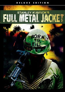
This is the artwork displayed on the DVD/Bluray box. Again, the emphasis is on the helmet, though there's a lot more going on in the background.

It's refreshing to see something different.
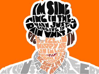
I like how type has created relevant imagery, and it's been placed next to just image. It's a good contrast.
Thursday, 3 March 2011
Hmm..
Well, very strange. Just nipped to the loo and what was staring me in the face? This..


I've been working on a poster containing information for Stanley Kubrick's A Clockwork Orange for most of the day. Hah.
Minimalist film posters
All of these are so so nice. I absolutely love how simple they are, yet they all work. Simple imagery and simple layout. I love it!
The colours used are also refreshing. What looks like a textured background on the Star Wars poster is a good idea.
I like how the design on the 'control, Anton Corbijn' poster leaves the frame of the format. It leaves the viewer in suspense and wanting to see more. It leaves more to the imagination.


Subtle
 I find this really nice to look at. It's incredibly interesting and very arty. The orange swishes in the background are inspiring and it's nice to have something decorative but subtle.
Shadow?
 The shadows could be something to keep in mind. I could somehow use this. Hm.
I like the stroke used around the silhouettes.

Monday, 28 February 2011

Sunday, 27 February 2011
Existing typographic posters
 I find this visually appealing. It hasn't got your average line after line approach. I like how letters have been split which compliments the other type, and represents what is being said/communicated.
The composition is lovely. It's refreshing to see an appropriately arranged type design.
I also like the colours used here. The background seems to be just off-black which is a nice idea. It's not too dark, yet still gives off deep, serious emotions. The white type on the background doesn't come across to powerful either.
The brighter colours are a nice touch.

This is similar to the poster above, though half of the number has been completed using illustrations. This is a great idea. It's really interesting and it's something I'm definitely going to think about having a go at.
I really like these (below). Rather than just plonking an image in the middle of the frame, composition has been carefully thought about. The designer has thought outside of the box.
They both look very appealing and attracts the eye. The colours are also really nice and work well together.


Saturday, 26 February 2011
Existing 'A Clockwork Orange' posters
 I'm aware of Stanley Kubrick's quirkiness and this really reflects in this poster.
There's a lot going on, and I feel as though it could do with being simplified a little.
I will use appropriate illustrations to represent the film, though a typographic outcome may be an option.

Another poster, successfully representing 'A Clockwork Orange'. A lot more simple than the poster above. Clean and bold shapes.

I find this poster very interesting. I think I find it more interesting than successful in terms of representing the film though.
I like how a different take on the eye has been used. Normally you would find a typical spherical shape with a smaller one in the middle, just like the poster above displays. It's refreshing to see something a little different, though as I said before, doesn't absolutely scream 'A Clockwork Orange'. The ide of 'different' is something to consider though.
Tuesday, 22 February 2011



Subscribe to:
Posts (Atom)