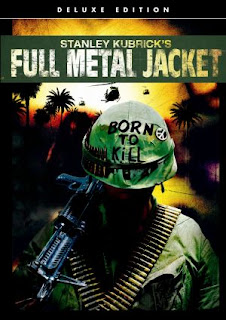
 There are a lot of posters showing off the helmet from the film, so now I think that's what's expected, though I don't really want to abide by this ''rule''.
..another helmet poster, more or less exactly the same as the poster above, though it's laid out differently.

This is the artwork displayed on the DVD/Bluray box. Again, the emphasis is on the helmet, though there's a lot more going on in the background.

It's refreshing to see something different.
I like how type has created relevant imagery, and it's been placed next to just image. It's a good contrast.
No comments:
Post a Comment